Steer Clear
Overview
A reward program for young drivers, which provides them with a discounted auto insurance policy. The app helped customers enhance their driving skills, gain knowledge, and empower them through informative courses.
I was charged with the task of rethinking and rebuilding our legacy application from the ground up. The legacy app wasn’t up to today’s standards with users’ expectations, visually, and from a technical standpoint. Users were unsure of how to complete the program and achieve better driving habits to result in lowering their insurance.
Project Type
Mobile App
Role
Product Design
User Experience Design
Visual Design
Interaction Design
After sifting through all of their feature requests, we were able to identify the main key pain points.
No way to track completion of lessons or drives that were taken
Relied heavily on agent for understanding of how to complete the program
Wanted an easier way to share progress of completion with parent/driving mentor
No gratification or measurement of success
“I need a way to keep my child safe on the road and help them get the skills needed to become a safe driver.”
“I need my independence. Don’t want to depend on my parents or friends to get a ride.”
Throughout the discovery phase we conducted user surveys which helped to build customer personas. This allow us to better understand the type of audience and needs of the consumer.
Age Range
16 - 25
app Rating
2.3
#C31820
#EB7302
#C31820
#E9B918
#01B391
#5F4EE0
Alongside a clean typeface, bold and solid colors would be applied to all elements within the interface to create a powerful experience.
Dark mode allows for users to customize their experience and provides the ability to adapt to the customer needs.
02
The overall goal of the design was to keep it fun and engaging, thus pushing the limits of the State Farm brand to build a stronger connection with customers. The look and feel of the app had to be energetic and inviting thus holding true to the brand. This was accomplished through visual treatment of illustrations, typography, color, and playful interactions.


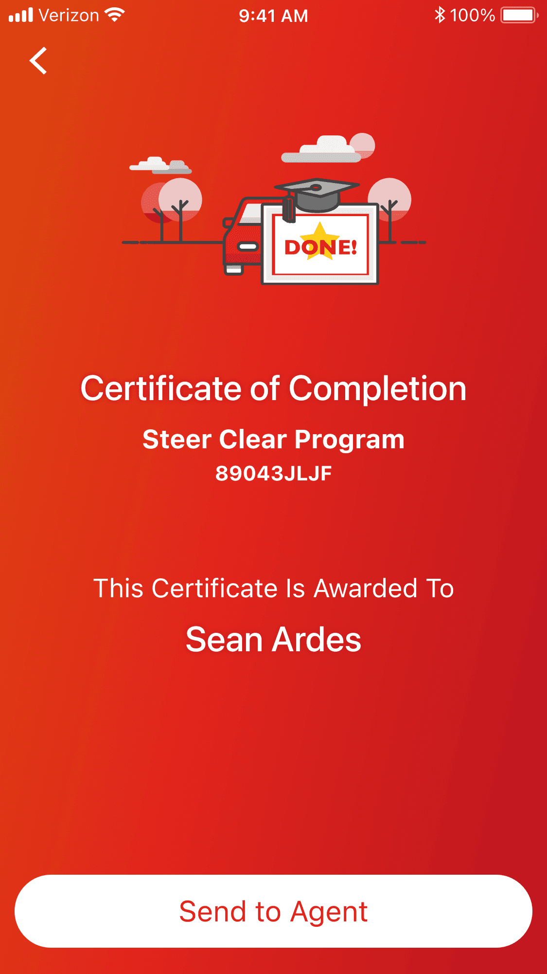
In completion of the course, customers wanted an easier process of ensuring their earned savings was applied to their account. In the legacy application a paper document had to be submitted to inform the agent of completion.
Upon completion, the user was provided a certificated of completion code
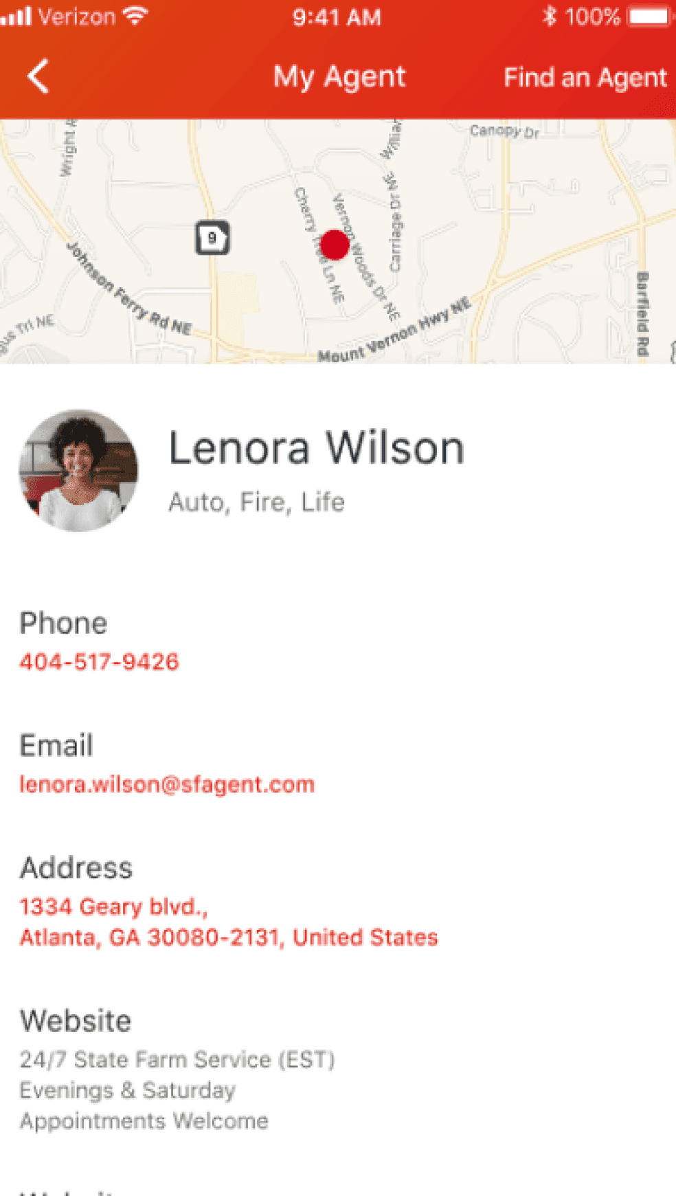
Provide easier access to communication with their agent
Improve awareness of when the saving would be applied to their account
Provided the ability for a driver to share their progress with their parents. With one simple touch parents where able to view real time updates of lessons and trips taken. This gave the parent an understanding of what’s being completed and the assurance of safety while providing the driver the sense of independence.
When using the app customers needed to feel a sense of accomplishment. So not only were they able to compare their driving habits based off their trips, they also had the ability to be rewarded with badges obtained through a good driving score or completion of courses.
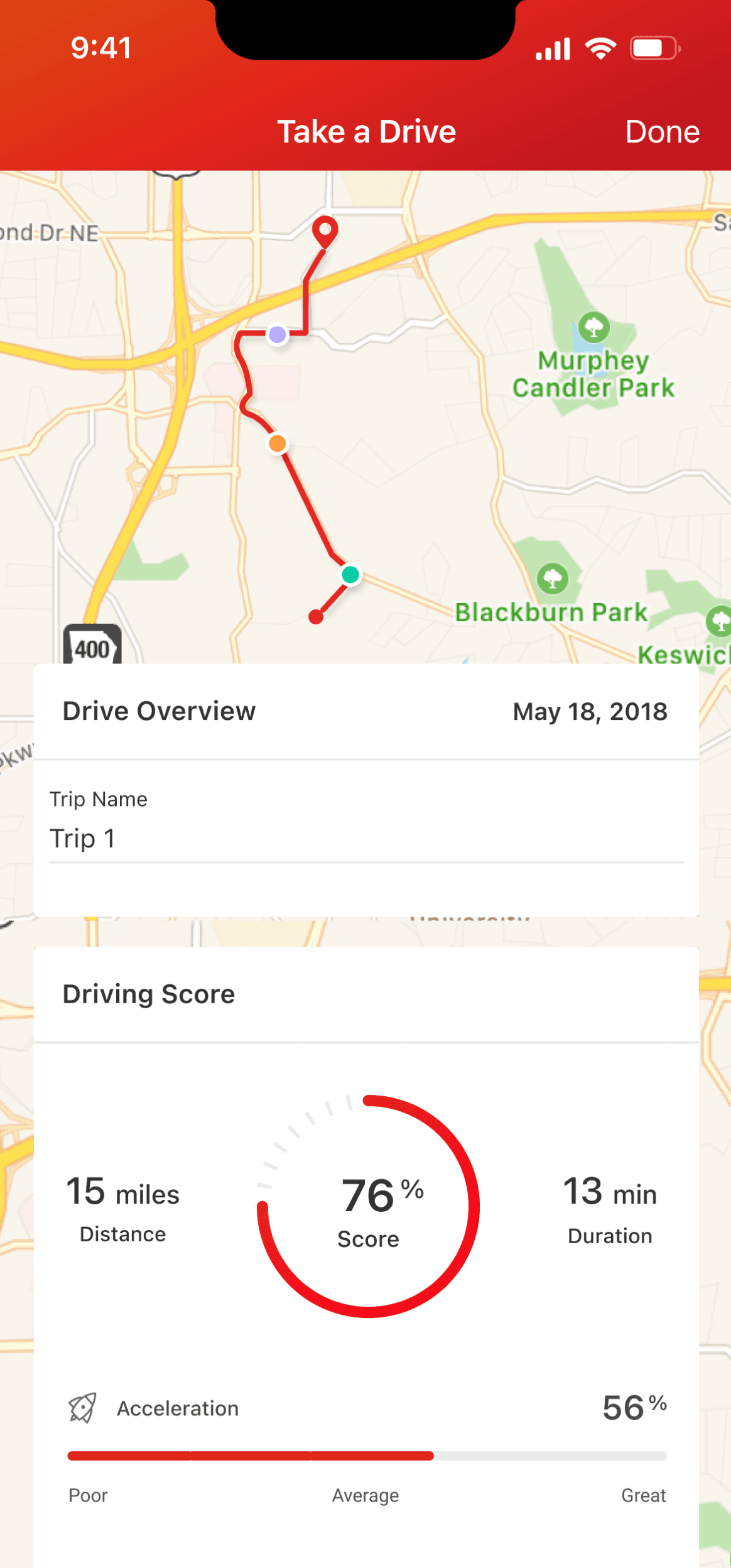
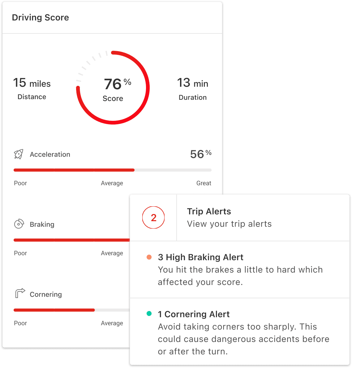
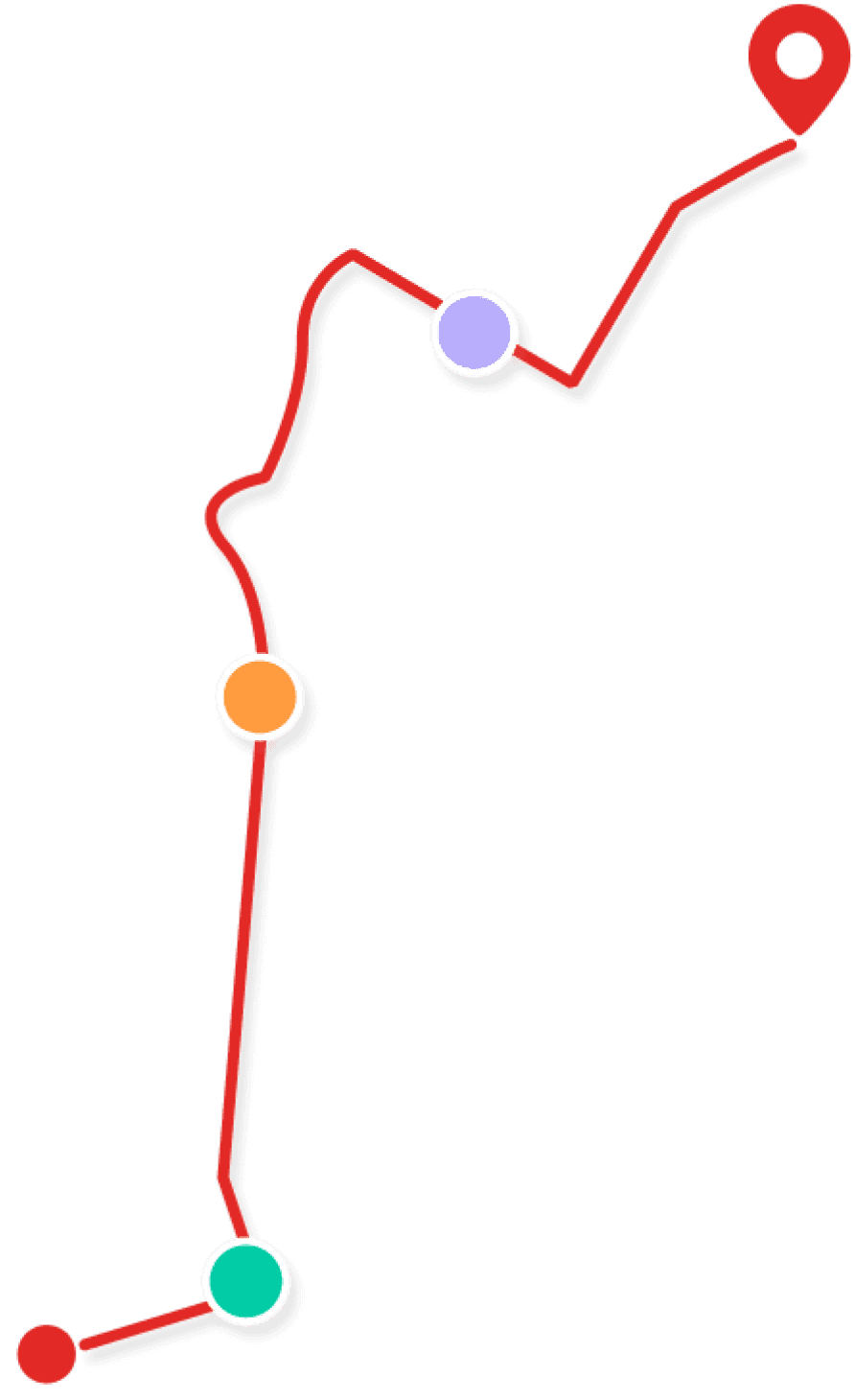
Improved the driver feedback by detailing when and where a user may have had hard breaking, acceleration, hard cornering, and phone usage. Thus providing a driving score and helpful tips of how to improve.
03
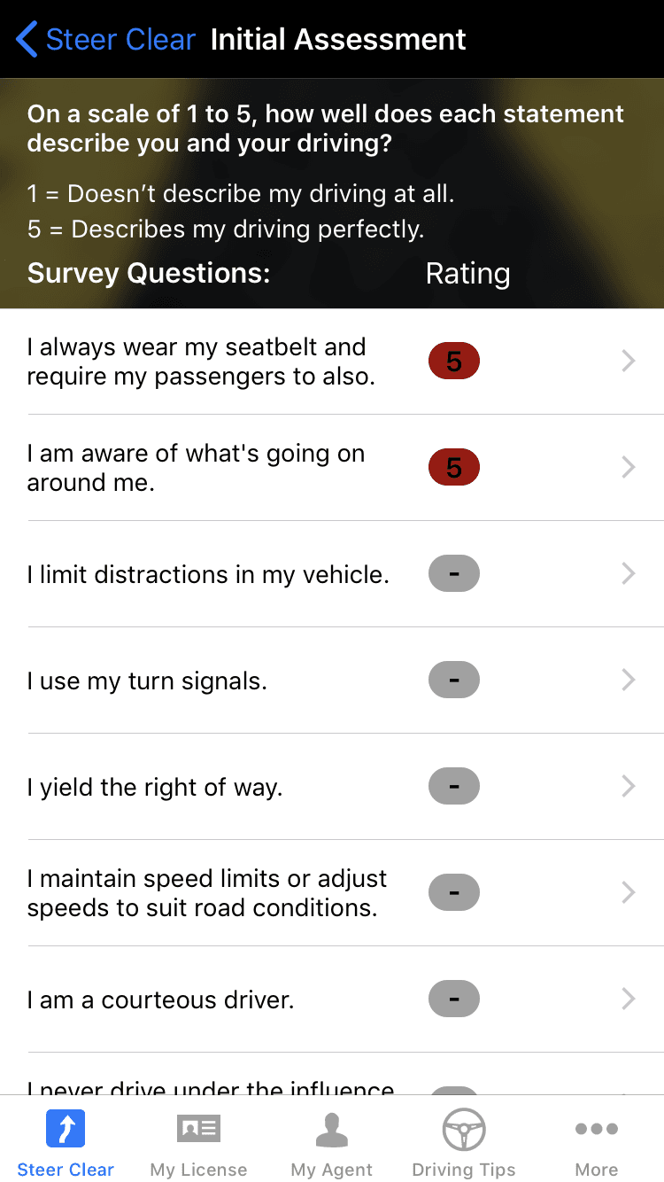
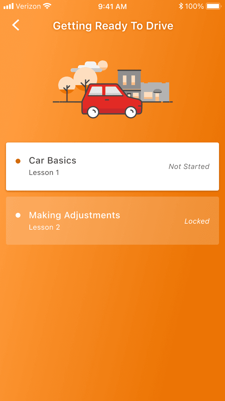
Understanding the teen driver and parent needs. They were able to track their progress toward completion from lesson to lesson, which enabled them to have gratification and organization within the app.
Preston is a joy to work with. He's out in front of his peers in his application of design trends. He's able to take a complex user experience problem and make the interaction look simple on the screen. He's got a real eye for design - line/type/color/balance and as a result his work has a touch of sophistication and polish that only very experienced designers can pull off. Some of this is table stakes for a good design leader, so Preston adds to this a can-do attitude and a natural interest in collaboration and teamwork that makes him stand out. I'd work with him again in a heartbeat.

Ben Rockwood
Creative Director at State Farm
After the release of Steer Clear, the app received many awards in various categories. Customer engagement increased to thirty-thousand from one-thousand within the first six month. Completion rate improved and we were able to decrease the call volume to agents in assisting with the completion of the app.
04
Great collaboration, establishing relationships with project managers, engineers, and business partners helped to move smoothly through conversations in understanding and working through tight timelines.
Moving effectively and efficiently, working in one week sprints shown that there was something to celebrate weekly.
05
Additional Projects
© 2024
