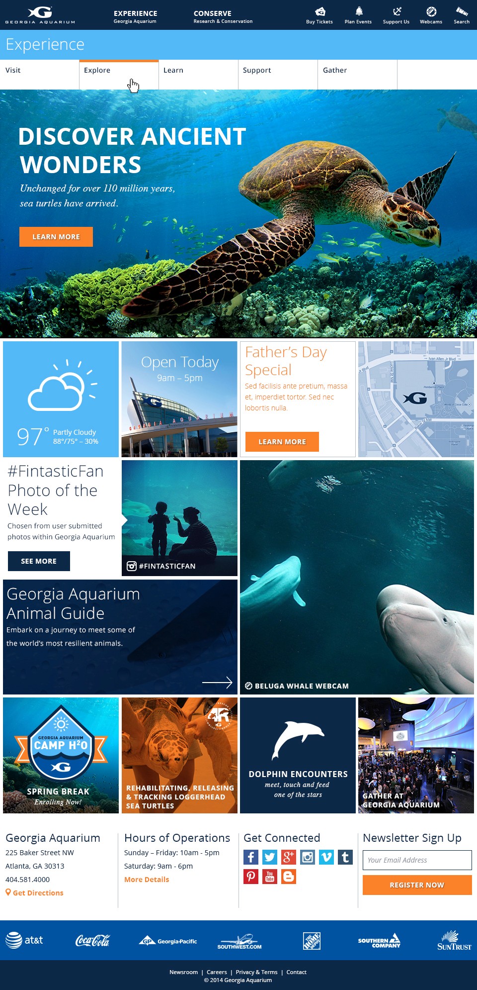
Site design
Overview
Georgia Aquarium is the largest aquarium in the United States and is the leading non-profit organization committed to working on behalf of all marine life.
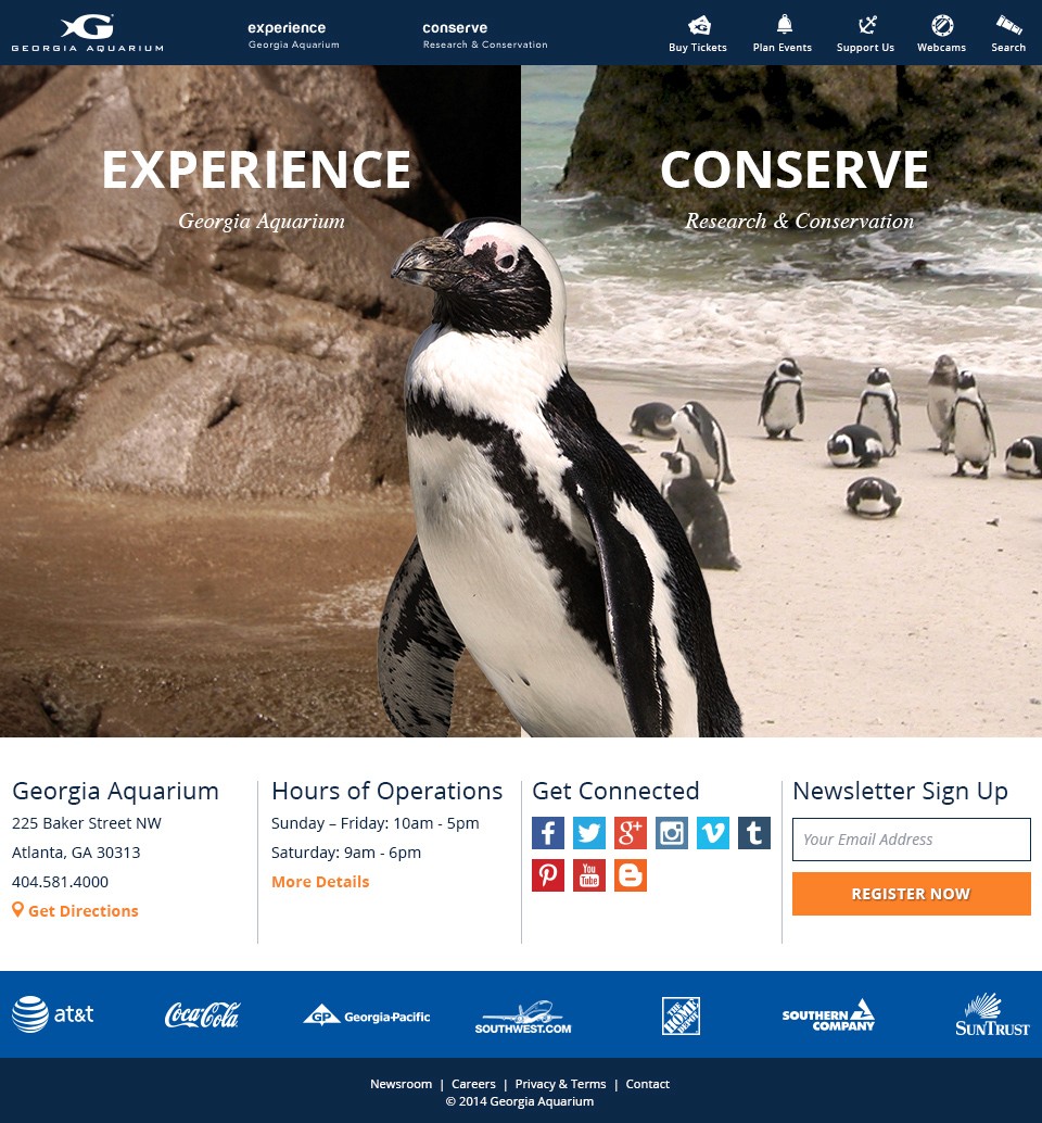
The site redesign had to capture the Georgia Aquarium’s scientific contribution in protecting marine life and also provide a fun, interative, educational experience. Showing both the science and fun side of the aqarium was a welcomed challenge. The final product was a stimulating and intuitive experience for both verticals and was an improvement to the navigational structure.
Role
User Experience Design
Visual Design
Interaction Design
Front-End Development
Project Type
Responsive Web
01
Aquariums occupy an interesting space online, acting as a hybrid of education and entertainment. Our research found that some brands attempted a heavier focus on education, research and conservation, others promoted events, exhibits and ticket sales.
Competitor Sites
Georgia Aquarium Original Site
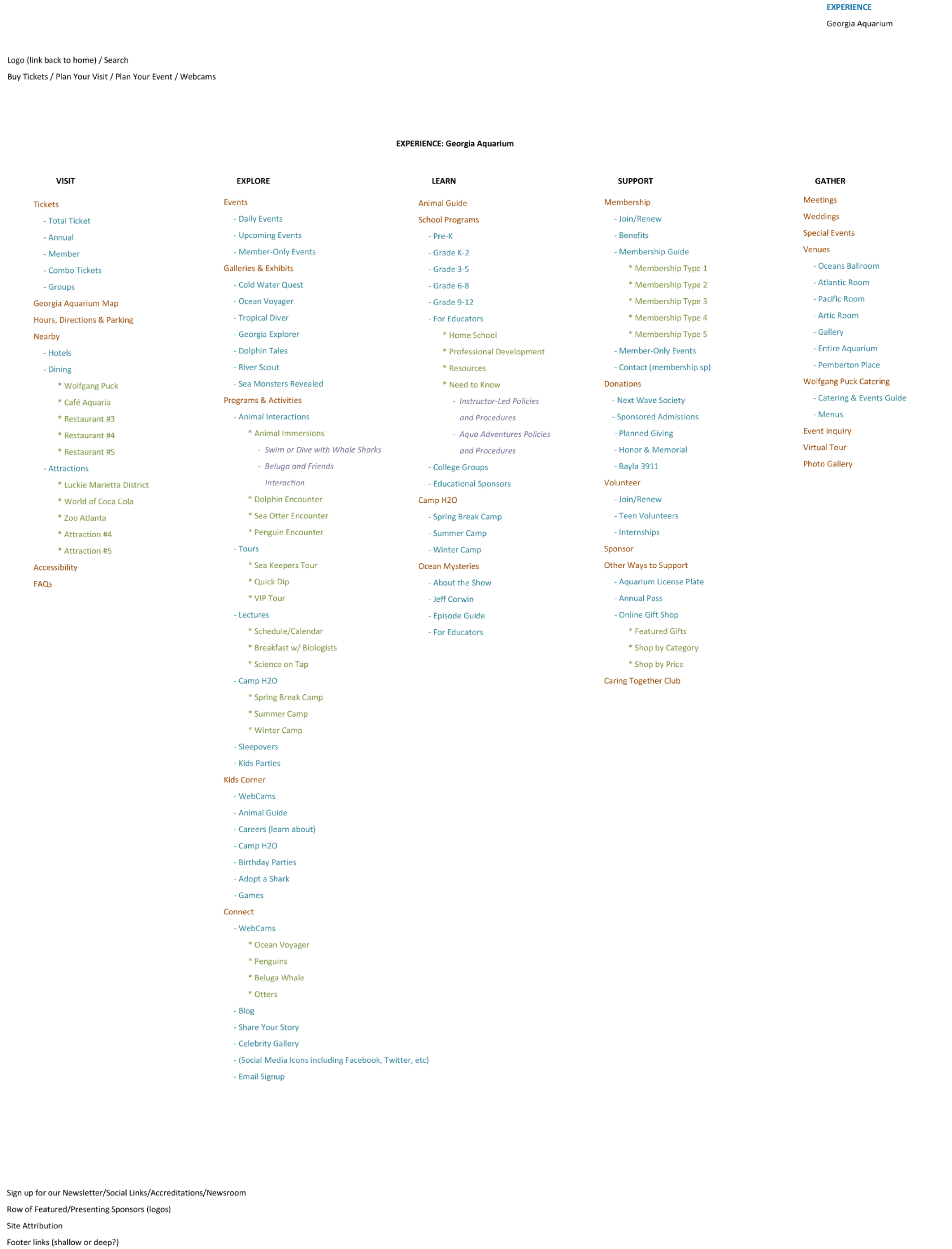
After understanding the business needs of informing customers of marine life while easing them through the purchasing process of tickets. There were some key navigational elements pain points that overwhelmed the customers when navigating.
No Hierarchy of Information difficult to distinguish which information is important
Cluttered menu with multiple menu items cram the drop-down and make the menu ineffective to visitors
Large footer unnecessary and waste of real-estate
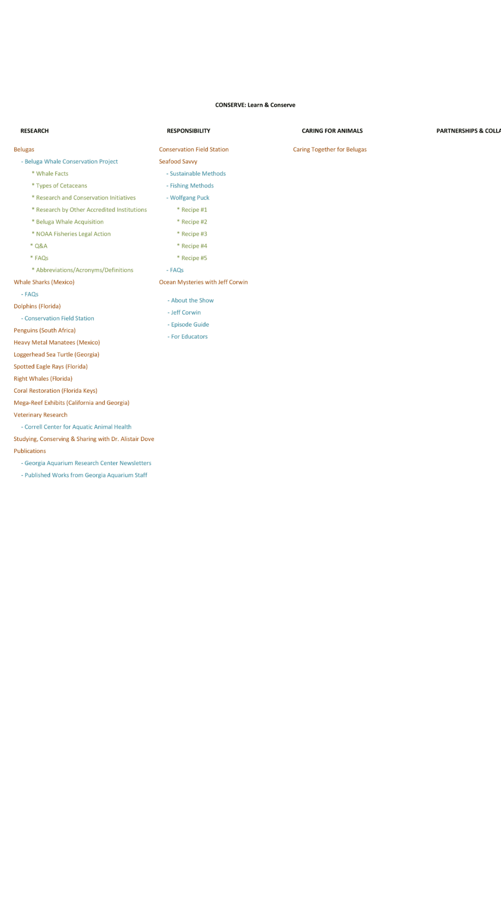
The overall concept for the site mimics the experience of the aquarium itself by letting users explore. The navigation, like the inside of the building, aimed to take the user into the homepage or “atrium” of the website, once they choose the path they want to explore, they will be guided along a linear path to the information they need.
02
The use of visuals, including photos, videos and graphics, excites and entices audiences, as well as improve the ease of locating relevant information and navigating the site.

Jake Burk
Art Director
It's rare to come across a young designer with such a strong combination of talent and humility. With a strong sense of both design and development, Preston has the ability to create unique experiences that are not only visually engaging, but also practical.
03
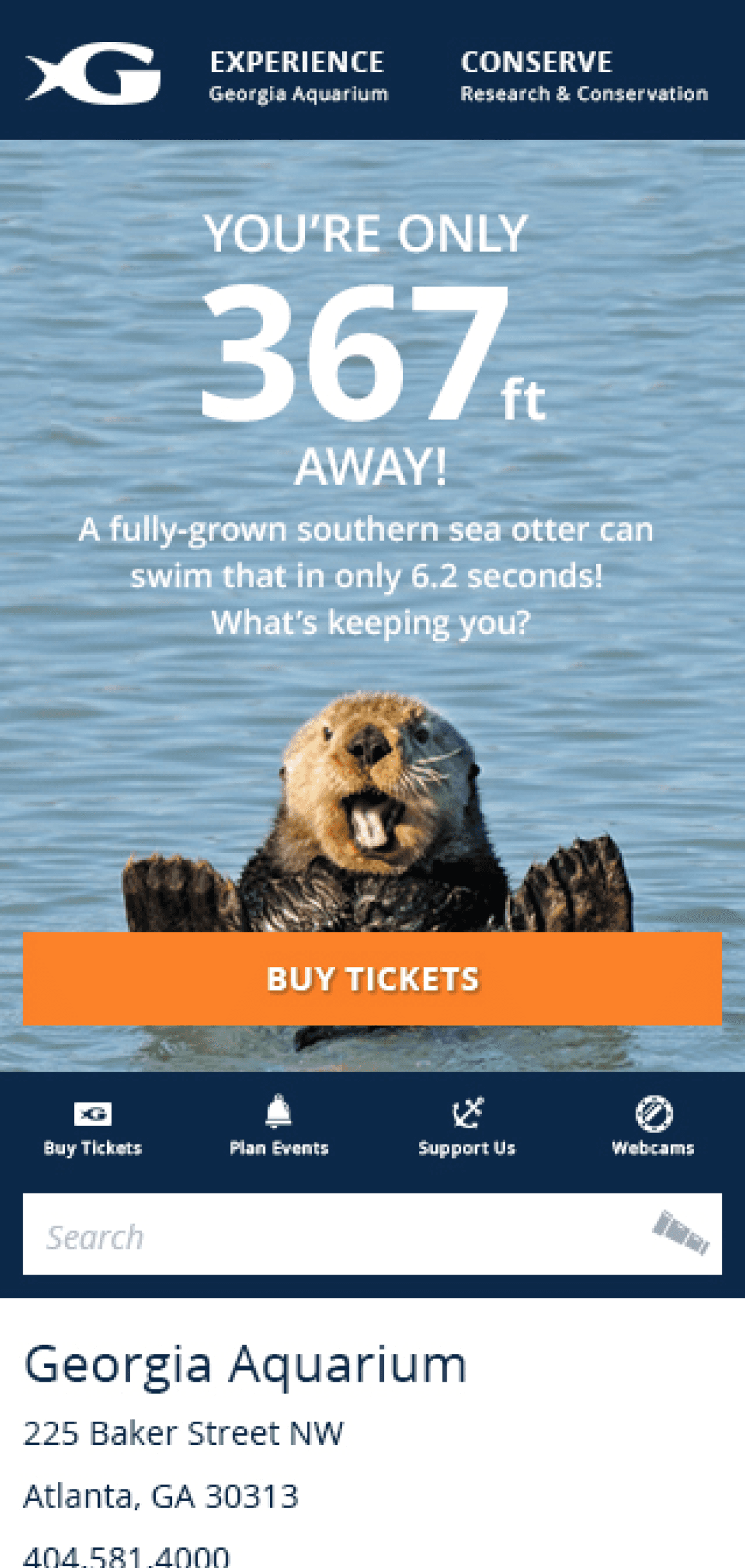
One of the key things that stood out was the significant amount of customer who were purchasing ticket within walking distance of the aquariums location.
As we were designing for the mobile experience, location play a key role in presenting the content to consumers. This was a huge opportunity to simply the experience base on their needs of a desired experience.


Daniel Andrews
Engineering Manager
Because Preston has a background in both design and development, he's got the rare ability to be able to understand both sides of the process of creating great web experiences. During my time with Preston, I saw Preston's ability to listen to the client and his team and deliver designs that met the goals of the project. Further, he designs things in a way that take into account the technical requirements of the project, which makes the build process go that much smoother. Preston also is an experienced front end developer that can translate design concepts into html/css/javascript that work on mobile devices as well as in cross-platform desktop environments. Finding folks that can do both of these things well is no easy task, but Preston's hunger to stay on top of the latest design and front end trends means he makes it look easy. Preston would be a valuable asset to anyone looking for an interactive designer or a front end developer - I hope that I get the chance to work with him again some day!

